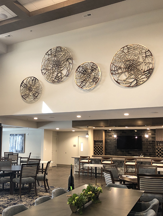
Biophilia means “a friendly feeling toward life.” Or as psychologist Erich Fromm said in 1964, “The passionate love of life and all that is alive.” Nowadays it’s a timely interior design trend for senior living.
Humans are hardwired with the desire to connect to nature-this friendly feeling toward life. It’s been proven to be essential for good health & well-being, both top concerns at senior living residences and healthcare facilities.
Before we spent our time in air-conditioned comfort and stuck in traffic on the freeways, our lives had a consistent connection to the natural world, to the movements of the sun, to the seasons.
Now that we must seek out those connections in more deliberate ways, architects and designers are meeting the need by creating structures and interiors which aim to provide us with nurturing contact with the outdoors.
Biophilic design seeks to increase the direct experience of nature via easy access to:
natural light, plants, water, natural landscapes and ecosystems, animals, air
Being able to access nature can alleviate feelings of stress, promote better focus and facilitate recovery from mental fatigue.
It can even enhance stamina and productivity. Good for everyone, right?
Definitely! Not only does the quality of life for residents improve, but staff members perform better at their jobs, attracting the positive interest of corporate decision makers when it comes to implementing biophilic design elements.
Those individual experiences of nature can prove more difficult with age, when lifting potted plants in the garden and visiting waterfalls is compromised by health issues.
Architects and interior designers do the major work in creating environments for senior living: providing sunlight to warm the skin, gentle air currents from falling water features, sounds of moving water and vistas of landscapes from prominent windows.
Art consultants support the biophilic interior design plans for senior living by providing art both suggestive and reflective of nature.
· Abstracts in natural tones such as greens with yellow and blues increase the feeling of being outdoors.
· Certain geometric shapes, like the hexagon, suggest the structure of a beehive.
· Wall sculptures of wood provide visual and tactile texture.
· Extreme closeup photography of leaves evokes memories of summers in the forest.
· Moving water can be beautifully suggested in soft abstracts.
· Landscapes provide vistas.
Just as interior design for memory care has its special considerations, art for memory care can be specially designed to stimulate tactile and auditory experiences in ways to spark memories of nature.
8180 Art Consulting can help you select art suitable for biophilic design for your next senior living project.


